Design with Clarity.

Thoughtful products, scalable systems, and experiences built to last.

A computer monitor displaying a scenic image of an ocean with waves crashing against rocks. In the background, there is a traditional Japanese torii gate standing on the rocks against a blue sky. The monitor has a sleek, modern design with a thin bezel and a sturdy stand.

More than Interfaces.

I design products, systems, and digital experiences that bring structure to complexity.

My work sits between UX/UI, design systems, and creative direction — always with a focus on clarity, usability, and long-term value.

Less Noise. More Intention.

I believe good design brings clarity where others add clutter.

It balances function, feeling, and structure.

Creating experiences that are easier to use, easier to trust, and easier to grow over time.

Proven across products, systems, and brands.

For over 17 years, I’ve worked with startups, scale-ups, and established companies across eMobility, SaaS, energy, healthcare, e-commerce, and finance.

From design systems and product UX to brand-driven digital experiences, my focus has always been the same: creating work that feels clear, useful, and built for real-world use.

bexio

Website system thinking, scalable structures, stakeholder workshops, and close collaboration between design and development.

innogy

Complex eMobility products, greenfield UX, and digital ecosystems shaped across multiple touchpoints and teams.
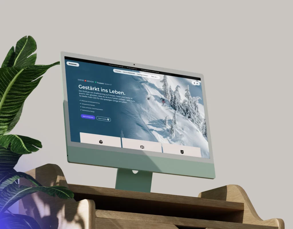
EISENHORN

Brand identity, UX-focused webshop design, and a component-based frontend system built for consistency and growth.

Gridfuse

Structured product design for demanding systems — with a strong focus on usability, scalability, and implementation reality.

Logo of Innogy featuring a stylized lowercase letter "i" next to the word "innogy" in a modern font.
The image shows the BenQ logo in black text on a white background.
The image shows the DHL logo in black and white. The logo features the letters "DHL" in a bold, stylized font, with horizontal lines extending from the sides of the letters, suggesting speed and movement.
The image shows the BMW logo, which consists of a circular emblem with the letters "B M W" at the top. The inner circle is divided into four quadrants with alternating black and white colors.
The image shows the logo of "bexio," featuring the company name in a simple, lowercase gray font on a white background.
The image displays the word "Gridfuse" in bold, black, stylized font. A small gray dot appears above the letter "i." The background is plain white.
The image shows the logo of RWE, featuring the letters "RWE" in bold, black font against a white background.
Logo of "AllCloud" featuring a stylized cloud graphic next to the text "AllCloud."
Logo of "thekey.ACADEMY" with the text in lowercase for "thekey" and uppercase for "ACADEMY," separated by a dot. The font is clean and modern, with a minimalist design in black and gray.
The image displays the word "PRISMA" in bold, uppercase, black letters followed by a period, on a white background.
Logo with a silhouette of a train in front of a stylized mountain. The text "RAILWAY HERO" is written to the right of the image.
Logo of Compleo, featuring a stylized symbol resembling an electrical plug on the left, followed by the word "Compleo" in rounded, bold letters. The design is in grayscale.
The image shows the Hymer logo, featuring the word "HYMER" in bold, stylized uppercase letters with three horizontal lines preceding the "H", suggesting motion. The logo is set against a plain white background.
The image shows the logo for "EISENHORN" in bold black letters with a stylized letter "E" that has a horn-like design.
Logo of Q-Park, featuring the word "Q-PARK" in bold, black letters with two diagonal lines, one black and one gray, beneath it on a white background.
Logo for Alica Preetz Coaching, featuring the text "Inspire Your Soul" in black with a star symbol, and "Coaching" in gray script.
Logo of a hyper company in travel, featuring a stylized landscape icon with a path and bird, accompanied by the text "FREEONTOUR."
Stylized text logo displaying the word "uxactly" in lowercase, bold, black font with a period at the end on a white background.
Logo displaying a circle with two connected nodes on the left and the word "REOS" in bold uppercase letters on the right. The design is in grayscale.
The image shows a logo with the name "Laura Malina Seiler" in a stylish and elegant font. The word "LAURA" is prominently displayed, with "MALINA SEILER" underneath in smaller, capital letters. The overall design is minimalist and sophisticated.
Logo featuring a stylized folder icon next to the word "vetevo" in lowercase letters.
The image displays the logo of "e.on," with the name written in a stylized, lowercase font.
The image displays the logo of Spread Group, featuring a stylized geometric heart shape to the left of the words "spreadgroup" written in lowercase black letters.
The image shows the Volksbank logo, featuring a stylized "V" with a horizontal line beneath it inside a rectangular shape.
Logo of Gazelle featuring the word "Gazelle" in bold, stylized letters next to a circular emblem containing an illustration of a leaping gazelle.

Trusted by teams that value clarity.

From startups to established brands, I’ve worked with people who value thoughtful design, reliable collaboration, and systems that hold up beyond the first launch.

Chris is a top-notch UX designer who combines deep industry knowledge with a strong creative instinct. Collaborating with him has been a pleasure. Thanks to his expertise, we’ve successfully enhanced our website’s design and driven a substantial increase in conversion rates.

We were very lucky to have you kicking-off and developing the design system with us that plays an essential role in the success of our product. I especially love that you helped us to develop a product UI that fits to our users and our brand. It was always a pleasure to work with you! Thank you Chris!

Portrait of a person wearing a dark hoodie with a letter "G" on it, standing against a gray background. It is the Head of Product at Gridfuse, Florian Sommer.

[…]I’m particularly impressed by his awareness of current trends and his ability to craft brand assets across all touchpoints. Chris is proactive, easy to work with, and highly adaptable to different stakeholders. After numerous projects across various brands and industries, I can wholeheartedly recommend working with him.

A smiling man with shoulder-length hair wearing a black shirt. It is the CMO of EISENHORN, Daniel List.

Structured, but never rigid.

I approach design as a balance between strategy, structure, and execution.

The goal is not just to make things look better — but to create systems that work in practice, align teams, and hold up over time.

Understand before designing

I start by understanding the problem, the context, and the people involved — before moving into solutions.

Build systems, not fragments

Good design should create consistency across products, teams, and touchpoints, not just improve isolated screens.

Stay close to implementation

I work with technical reality in mind, collaborating closely with developers to make sure ideas survive beyond the concept phase.

Next Steps

Let’s take it further.

Read the background. Explore the work. Start a conversation.

Full Background

CV

Dive deeper into my background, experience, skills, and the path behind the work.

Selected Work

Portfolio

Explore a curated selection of digital products, systems, and brand-driven design work.

Let’s Talk

Contact

Have a project, need support, or looking for a design partner? Let’s start the conversation.